There is a particular kind of surprise that comes when someone sees you clearly, knows something about the mess you are carrying around inside, and reaches toward you anyway.
You might expect that to feel entirely wonderful. And it does. But something else happens, too. The moment love becomes real, the possibility of losing it becomes real. The very thing that makes you feel alive can awaken the part of you that has learned to protect itself.
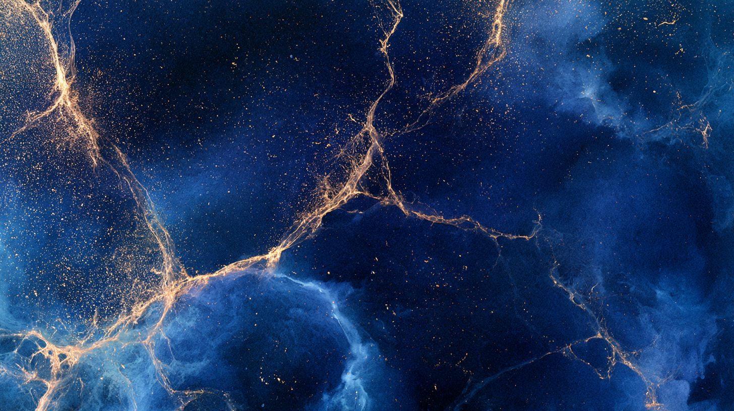
I wanted to make a video about that experience. Not a story about two people. Not faces, hands, or recognizable figures. Just abstract watercolor, color, movement, and the strange weather that happens inside a human being when love gets past the defenses.
Welcome to another trip into my subconscious. Please keep your hands and feet inside the vehicle.
Page 1/9
The idea: love without a guarantee
I called the project WHEN LOVE REACHES BACK.
The title came from the moment when reaching toward someone stops being a solitary act. You discover that something is reaching toward you, too. You are no longer simply imagining connection or hoping that someone might understand. You have experienced it.
And that changes things.
I wanted the video to hold two apparently contradictory feelings at once: the joy of discovering that you are worthy of love, and the fear that something so precious might not last.
I did not want to explain those feelings with a literal narrative. I wanted the viewer to experience them through images that change, combine, separate, and become something they were not before.
Watercolor seemed like the right medium. Pigment does not always behave according to plan. Colors bleed into each other. Edges dissolve. A beautiful shape can become something unexpected when water carries it somewhere else.
That seemed a pretty good metaphor for relationships.
Lab note: I am increasingly interested in letting the medium participate in the meaning. I can specify what I want an image to contain, but I cannot completely control what the result will feel like. Sometimes the useful discovery happens in the space between the two.
Page 2/9
Step 1: Begin with emptiness
The opening images are quiet. Vast areas of indigo and ivory. A small pool of cerulean. Fine branching lines that approach one another without quite meeting.
I wanted the beginning to feel like an inner landscape before anything changes. There is room to breathe, but there is also distance. Something is missing, although the image itself does not announce what that something is.
This is one advantage of abstraction. A literal image tells you what you are looking at. An abstract image gives your own experience somewhere to go.
One viewer might see loneliness. Another might see anticipation. Someone else might simply enjoy the way blue pigment spreads across paper.
I do not need to settle that question for them.
The first colors gradually approach one another. Blue meets amber. Their edges mingle, and fine gold filaments emerge from the point of contact, branching into the surrounding color.
The important thing is that neither color simply disappears into the other. Their meeting changes both the composition and the space around it.
That became the first visual statement of the project: connection can create something that did not exist before.
Page 3/9
Step 2: Discover the gold that was already there
As the colors become more complex, gold begins to appear inside the blue and violet.
I wanted it to feel less like a decorative effect and more like something being discovered. Imagine a geological cross section in which a vein of gold runs through ordinary stone. The gold did not become valuable because somebody found it. Finding it merely made the value visible.
That distinction matters to me.
There is a difference between believing that somebody’s affection makes you worthy and discovering that being loved can help you recognize a worth you already possessed.
The images move from isolated gold traces to larger, more vibrant fields of color. Cerulean, indigo, violet, coral, amber, and gold begin to interact. The compositions become more expansive and alive.
Then, at the height of that expansion, I introduce a concentrated bloom of amber and gold surrounded by deep indigo.
I wanted that moment to feel precious without becoming sentimental. Not a greeting card. Not a motivational poster. Just a small, luminous thing in a great deal of darkness.
Lab note: I have to keep reminding myself that emotional intensity does not require visual clutter. Sometimes the most powerful thing an image can do is leave enough empty space around the important part for the viewer to notice it.
Page 4/9
Step 3: Let the fear enter the picture
Of course, my subconscious was not going to let me enjoy the pretty colors without complicating things.
The gold begins to fracture. Fine threads separate. Some dissolve into violet and blue. In the darker images, gold veins appear against charcoal and indigo, like fissures in a surface that may or may not hold together.
This is the point where the emotional direction changes.
The discovery of love does not automatically erase the fear of losing it. In some ways, it gives that fear a new object. There is now something precious enough to lose.
I wanted the images to communicate that shift without turning the entire video into a disaster movie. The fear is real, but it does not have to consume the whole landscape.
So the compositions begin to open again. Color recedes toward the edges. Pale paper appears between the darker fields. Gold remains, but it is no longer concentrated in one vulnerable bloom.
The visual question changes from “Can I keep this?” to something more difficult: “Can I allow this to matter, even though I cannot guarantee what happens next?”
That is not a question an AI image generator can answer for me. It can, however, help me build a visual language in which the question can live.
Page 5/9
Step 4: Make room for freedom
One of my favorite ideas in the project is that two colors can touch without being forced to merge.
Blue and amber approach. Their edges interact. Then they remain distinct, each with its own movement and character.
I wanted this to represent connection without possession. Love does not have to mean that two people become indistinguishable, that one person absorbs the other, or that closeness eliminates the need for freedom.
That sounds obvious when I write it down. It is not always so obvious to the nervous system.
The images explore that idea through parallel ribbons of color, tendrils that reach across open space, and separate fields that remain connected without becoming symmetrical.
Some compositions are almost balanced. Others are deliberately uneven. The colors do not always cooperate with my preference for a pleasing arrangement. Neither, for that matter, do people.
The later images begin to integrate the earlier fractures. Gold lines connect separated regions of blue and indigo. The structure changes, but it does not return to its original state.
I did not want a tidy restoration in which everything becomes whole again and nobody has any difficult feelings.
Integration is not the same thing as going back to the beginning.
Lab note: A relationship can matter deeply without becoming a guarantee against loneliness, change, or loss. I wanted the visual language to make room for that truth rather than cover it with a happy ending.
Page 6/9
Step 5: Direct the AI, then get out of its way
The practical work involved writing individual prompts for a sequence of 25 abstract watercolor images.
Each prompt had to stand on its own. I could not rely on vague instructions such as “continue the previous image” or “make it look the same.” The image generator needed explicit descriptions of the composition, palette, texture, contrast, and emotional direction.
I also wanted the images to feel like parts of one visual world without looking like 25 variations of the same picture.
That meant changing the scale, the placement of the color, the amount of negative space, the density of the pigment, and the relationship between light and darkness.
A few images needed to feel nearly empty. Others needed to fill the frame with color. Some had to suggest movement toward something; others needed to create the sensation of pressure, separation, or release.
The challenge was not merely producing attractive watercolor images. It was giving each image a job to do in the emotional sequence.
I tested a few prompts before committing to the full set. That was useful because an idea that sounds excellent in a text prompt can become repetitive or visually muddy when rendered.
The process required iteration, and I had to resist the temptation to solve every problem by adding more adjectives. Sometimes the better fix was a simpler composition or a more decisive contrast.
The goal was not to make 25 beautiful pictures. It was to make one evolving experience out of them.
Page 7/9
Step 6: Give the images a voice
The narration carries the personal meaning of the project. The images provide a second voice, one that can suggest rather than explain.
For music, I wanted an instrumental cinematic score with intimate piano motifs, warm cello and viola, restrained low strings, and atmospheric textures. It needed to grow gradually, with moments of tension beneath the tenderness and swells of emotional power.
I specifically did not want a dance beat, a toe-tapping rhythm, or percussion that would turn the piece into something upbeat and propulsive.
The music should move emotionally rather than physically. It should give the narration room while allowing the underlying feeling to deepen.
I also wanted to avoid a grand, final resolution. The subject is not a problem being solved. It is an experience being integrated.
The editing will bring the elements together through slow movement, restrained zooms, dissolves, and occasional harder transitions when the emotional shift needs a sharper edge.
The images do not need to move much to feel alive. A slow approach toward a gold vein, or a gradual reveal of empty space between two colors, can be enough.
Tools and creative stack
- Midjourney: generating the abstract watercolor imagery from individually written prompts.
- Grok imagine: image-to-video conversion
- Google Flow Music: Instrumental AI music generation: creating a cinematic score that supports the narration without a dance beat.
- Kdenlive: assembling the images, narration, music, and transitions into a finished video.
The important part is not the size of the tool collection. It is getting each tool to contribute something the others cannot.
Page 8/9
The real discovery: love is not proof against fear
The more I worked on this project, the more I returned to the distinction between being made worthy by love and discovering your worth through being loved.
Those are not quite the same thing.
When somebody sees you in a way you have rarely experienced, their attention can reveal possibilities you had trouble seeing for yourself. You may begin to recognize qualities that were present all along but hidden behind old defenses, old shame, or old assumptions about what you deserve.
That recognition can be life-changing.
It can also make you afraid. Once something matters, you can imagine losing it. The mind starts rehearsing possible endings, sometimes before the present moment has had a chance to finish happening.
I wanted WHEN LOVE REACHES BACK to acknowledge both sides without allowing either one to cancel the other.
The fear does not prove that the love is false. The love does not prove that nothing painful will ever happen. And the uncertainty does not mean the experience was not real.
I do not have to know how everything ends before I can receive what is here.
That may be the simplest sentence hiding inside all these layers of pigment.
Lab note: AI is particularly interesting as a creative partner when it helps me approach something I know emotionally but cannot yet express visually. I bring the lived experience, the intention, and the judgment. The machine gives me possibilities I would not necessarily have imagined on my own. Then I keep the results that feel true and revise the ones that do not.
I am still the video alchemist. The orchestra just happens to contain several machines that occasionally misunderstand the assignment.
Page 9/9
A little unfinished, on purpose
The final images let the gold disperse through blue, indigo, and violet. The colors fade toward the ivory paper, but they do not disappear completely.
I did not want the ending to announce that everything is settled. The future remains open. The colors have changed, and the gold is no longer confined to one fragile place.
That is enough.
I cannot make love permanent by being afraid of losing it. I cannot protect myself from every possible hurt without also closing the door on some of the experiences that make life worth living.
But I can let an experience matter. I can allow it to change what I believe is possible. I can carry what it taught me, even if the future refuses to sign a contract.
That is what I wanted this video to hold: not a promise that nothing will ever break, but the possibility that something beautiful can remain meaningful even when certainty is unavailable.
The pigment reaches across the paper. The gold catches the light. And the picture is allowed to remain unfinished.
Maybe that is where the real work begins.
Steve Teare
video alchemist
TerminallyBored.Monster
Palouse, Washington USA
PSYCHOLOGY
WHEN LOVE REACHES BACK is a quiet, first-person meditation on the internal shift that can occur when someone reaches toward you and you feel, perhaps for the first time or with unusual clarity, worthy of that affection without having to earn it.
The narration moves through a recognizable psychological sequence: an initial sense of something rare and healing (“Their affection feels freely given. You don’t feel you have to earn it. And something inside you begins to change”), followed by the emergence of fear once the experience registers as real and precious, and then a deliberate choice to let it matter anyway without demanding permanence or turning it into an obligation.
Core dynamics
At the center is the distinction between being made worthy and feeling an already-present worthiness. The speaker is careful on this point: the other person does not create the worth; their freely given regard helps the speaker begin to register something that may have been understood intellectually but not fully believed. This is a classic relational mechanism. External affirmation, especially when it is not contingent on performance, can loosen older internal working models (“I am only lovable if…,” “emptiness is the baseline”). Once the baseline shifts, the old emptiness is no longer neutral; it becomes a known contrast, which intensifies the stakes.
The fear that arrives alongside the joy is not presented as a flaw to be overcome but as a natural consequence of having something to lose. The line “once you’ve experienced a kind of love you didn’t know how to feel before, the emptiness you knew so well becomes something different” captures the double-edged nature of attachment activation. Systems that were adapted to scarcity or conditional regard often become more anxious precisely when safety appears, because the cost of potential loss has now been made concrete. The speaker names this without collapsing into either pure gratitude or pure dread.
Attachment and self-worth themes
The piece shows several markers of movement toward more secure relating:
- Refusal to convert the other’s free choice into an obligation or guarantee.
- Explicit wish to receive without manufacturing the feeling or controlling the outcome.
- Willingness to remain honest about fear while still allowing the connection to matter.
- Emphasis on bravery as the capacity to stay open rather than as the absence of anxiety.
These are not the hallmarks of pure anxious pursuit (“please stay so I can feel okay”) nor of pure avoidance (“I must not need this”). They describe an intermediate position: the value of the connection is acknowledged, the limits of control are accepted, and the self is not required to collapse or armor up in order to tolerate the uncertainty. That stance is psychologically demanding; many people either minimize the importance of the bond or escalate demands for reassurance. The narration holds both the preciousness and the uncontrollability in view at once.
The abstract watercolor imagery (described in the video’s framing) supports this psychologically. Watercolor’s bleeding edges, partial transparency, and resistance to hard outlines mirror the emotional territory: something is forming and being received, yet it remains fluid and unfinalized. The visual language does not resolve the tension into a neat “happily ever after” or a clear loss; it stays with the process of reception.
What the piece does not claim
It does not assert that the other person will stay, that the fear will disappear, or that feeling worthy is now permanent. It ends on the desire to be “brave enough to receive it” even while knowing how much it matters and not knowing the duration. That is a mature formulation of non-contingent openness: the worth of the experience is not made dependent on a future outcome, and the self is not required to pretend the stakes are low.
In short, the video articulates a particular moment in relational healing—the moment when an external, freely given regard begins to update an internal sense of worth, and the person chooses to stay present to both the aliveness and the vulnerability that update creates. The honesty about the accompanying fear, and the refusal to solve it by either clinging or withdrawing, is what gives the piece its psychological precision.